Friday 2 November 2018

Norwich Beer Festival Logo Design

6B2 - Networking.

6D2 - A good social media opportunity, people were talking about my work and were lead to my social media. Also gave me a reputation in Norwich circles for further freelance design work. It involved professional back and forth with the organisers of the festival and the social media officer.

As part of a project last year, I submitted a logo design for Norwich Beer Festival and won the competition. As a result of this, the festival printed the design on glasses, badges, t-shirts, brochures and other memorabilia. Attending this was an interesting opportunity for networking, many people were interested in the logo and it lead to conversations about design work.


This was a privileged to be a part of, the beer festival is something that most people in Norwich know of. Many people collect the glasses year on year and it's interesting to think that my work may be preserved in this way for years to come. Walking into the festival was also a driving experience, seeing the glasses being held by masses of people was exciting. It felt like a massive achievement and it made me want to have my work printed and produced on a big scale again. In the future I hope to enter more competitions and potentially do work for festivals like this.


General coverage of the event:

Because the festival is quite popular in Norwich, there was some local and digital coverage of the event. This meant that more people were linked to my design account and I felt a general motivating sense of achievement.

Local newspaper coverage
Norwich beer festival Instagram account

Glug Leeds - 'What I Wish I'd Never Known' 27.9.18

6A2 - This included experiencing talks from designers, specifically aimed at aspiring students.

6B2 - Specifically attending a networking event and talking to designers from the local area.

Glug Leeds is a movement that runs a series of talks and networking events for creatives around Leeds. I attended this wanting to gain practice in socialising with graphic designers and to hear some advice directly aimed for creatives just starting out. The talks heavily focused on pitfalls to avoid and routes into design. One thing that I took away was that enthusiasm and taking opportunities is incredibly important in pursuing a creative career.

Andrew Brown - Brass Agency

  • When you're trying to find a solution to a problem, think of what want to create and make it fit. Think left field and it will come easier.
  • Ordinary people can be successful if they have drive.
  • Don't try to be something, just be it. Creativty is in your bones, you're hungry for it. People who have success are constantly doing things, not waiting for things to come to them.
  • 'What you shouldn't know is the destination.' 


Jonny Ridout - Freelance Sound Engineer

  • Is a house engineer for Hyde Park Picture House and Headrow House among others.
  • Experience is your worth, not your qualifications.
  • Take advantages of opportunities.
  • It's not what you know, it's who you know. Personal relationships are as important as networking.
  • Took help from the Princess Trust to gain funding for something he wanted to pursue - videography.
  • Shadow people until you know you're at a standard you can charge for.
  • Charge according to who the client is.

Simon Forster - Robot Food 

  • A strategic branding agency.
  • Robot Food created clients and did work to illustrate their experience.
  • Experience is everything, although determination is more valuable than experience.
  • Take any risk, even if you've never done it before.
  • Naivety in the industry just means you have a fresh perspective. 
  • Instead of applying for competitions they chose to work and brand for health and beauty. In particular Electric Ink, which was a cosmetic brand for people with tattoos.
  • You can't make it on your own!   

Monday 29 October 2018

Harewood House Trip - Lord Whitney

6A2 - Documented research into a design studio with similar themes of work to my own practice. Their Seeds of Hope project particularly resonated with me because I have an interest in resurrecting historical ideas through design.

6B2 - As a result of this I contacted Harewood house about volunteering for their next Christmas installation.

Lord Whitney are 'connoisseurs of make believe' and pride themselves on not have a defined discipline. They have done set design, editorial, music videos, tv and immersive experiences, across a range of clients with big names. They were inspired by The Mighty Boosh and Annie Atkins and have very extravagant and bold ideas. They have a lot of knowledge about random techniques and solutions that they have built across the years. Some of their work includes:
  • A Niki Minaj music video which included a team of 30 different people that needed coordinating.
  • ITV Creatives which were adverts for television programs. One of which included sourcing 3000 glass jars.
  • Worked with Netflix to create a 'behind the scenes' set for social media. Involved researching prop design and sets for Stranger Things, Riverdale and Pretty Little Liars.
  • Used art council funding to research folklore across Yorkshire. Got a series of photographs and made a 'choose your own story' book. A bespoke typeface was made for it, with different stocks, with different features like fold outs.
  • Pitched an idea of Leeds Council to create a folklore themed winter experience in Leeds museum, instead of the Christmas grotto they originally asked for. Suggesting its important to take chances and make bold moves in order to do work you're really fond of. They created an installation in the crypt of a mysterious woods. They didn't have time to finely tune it but the ambiguity suited the theme. 
The Seeds of Hope at Harewood House

This Seeds of Hope project was something that I found particularly relevant to my own practice. I have a keen interest in design for history and resurrecting ideas and stories from the past creatively. This is something that I want to potentially go into in the future.

The Seeds of Hope project was an immersive installation forged from extensive research about Harewood House's role in WW1. They read letters and stories and papers about the time and created a guide telling several people's story at Harewood. People could take what they wanted from this, with the installation giving clues and stories that linked to the guide. Everything was down to the research, which is something Lord Whitney seems to take incredibly seriously. For the installation itself, the immersion seemed most important. They focused on things like smell and made sure there was no signage in the actual rooms, which would have pulled from the experience.

They were also involved in the gardening, responsible for planting a peace garden with cosmo flowers. Which acknowledged those who were lost and symbolising mental recovery. They also planted a sunflower for every person that recovered at Harewood House. The sunflower heads followed the sun and were planted in sandbags similar to those used in war. The seeds could also be taken, as the guest's very own 'seeds of hope'.


Advice for the Future

Lord Whitney said yes to everything and its helped them learn what to say no to. They advise to stick to your guns and not to give into client stress. Their personal creative work has lead to client interest which suggests the importance of making work you enjoy. They talked a lot about the balance between doing work you enjoy and earning money for it, it is something that needs consideration and equal weight.

What I think was most interesting about this experience was that Lord Whitney created a job for themselves and paved their own way. They saw a gap in the market and began making work that they enjoyed and others enjoyed too. For my future I hope to not loose sight of a job that I enjoy, and to consider the steps I could make in achieving it. Lord Whitney have created so much in 10 years, including Scott Hall Mills which is a creative organisation filled with designers working on their own practice.

Sunday 20 May 2018

End of Module Evaluation

Overall this module has gone well. I have learn't a lot about the graphic design industry and how I can work my way into being a part of it.

Throughout this project I have learnt the importance of gaining new experiences and seeing creative work whenever I can. I have been to several exhibitions and been a part of one, which has opened my mind to new art forms and introduced me to other creatives. Berlin was an incredible experience and gave me a real insight to what is like to work professionally within a studio. Seeing designs has given me a drive for the future and an insight into the steps I need to take to get there.

The creative report was by far the most useful aspect of this module. The advice given to me by creatives I admire was perfect and unique, it really motivated me to work with passion and drive. One of the best bits of advice both Ali and Rea gave me was to read more, which is something I have sincerely taken forward. Talking to them has really given me the confidence to contract creatives in the future and maintain contact too.

The 'Life's a Pitch' project was also a useful task as it meant that I could practice skills in collaboration and compromise. I think I worked well within the group, offering up ideas and solutions at every opportunity and contributing work consistently. We made sure the pitch was concise and articulate, with much research backing it. I didn't present as we had stronger presenters in the group, however this is something I really want to work on.

In fact, the final presentation was something I really struggled with. I found it easier in first year, which could have been because we'd  had more practice in first year or because I was more confident about the work I was describing then. I think the key to a good presentation is to fully believe in the work you're communicating, which I didn't this time round. In future I hope to organise the sequence of my slides better and to spend more time rehearsing. With enough preparation and practice I hope presenting will be easier in future.

Studio Brief 3 - Final Presentation

Saturday 19 May 2018

Studio Brief 2 - Feedback

The feedback for our presentation was mixed. It was acknowledged that we did a good level of research, which had clearly fueled our idea generation. However, it was suggested that we should have identified more specific problems within the institution and then presented our ideas as solutions.

Another point was that our 'Arts and Crafts' approach was good because it played into the institutions love of heritage. However, it was also suggested this theme ignores the technological future we seem to be speeding towards. In order for the new building to be applicable to future generations, we need to prempt that people will be looking for technological environments.

Overall it was also said that the pitch was well presented, thanks to Holly and Jasmine. However the feedback also says it was 'under presented', it could be that this was because we didn't delve deep enough into our ideas. I might be inclined to disagree with this, as all our ideas were thoroughly discussed, explored and researched beforehand, and in the presentation they were refined into concise points.

Friday 18 May 2018

Studio Brief 2 - The Pitch

We then put the presentation together and Holly and Jasmine presented it. This went well, they were articulate and consise about our ideas! We practiced it several times before the performance, which allowed us all to make sure that Holly and Jasmine conveyed our ideas. Each slide we ensured were very picture focused with minimal writing just to surmise the points. The last slide of summary was particularly helpful to round it off.

Studio Brief 2 - Wayfinding Tree Development

For the wayfinding we decided to have a tree made of colourful strip lighting that would direct people around the university to the course they wanted to go to. Jasmine and I had a long discussion about this whilst walking around the collage and the technicalities of how this would arranged. We walked around the university and made sure that the trees would make sense. Originally we wanted to have strips that would line the ceilings, however we realised this wouldn't work and inside we would have trees that had the lenghth of lines represent the distance needed to travel. E.g. Blue = Photography and this is the furthest distance to travel because the line is longest.

Studio Brief 2 - Confirmed Ideas and Development

Because we'd decided to have an Arts and Crafts theme, we began researching this. The key features were the patterns, the use of light, metal frames and nature - these were all translated in contemporary features for the university. After that we began deciding on all the different aspects we had discussed and how these would be visually represented in the presentation. These elements included:
  • Plants.
  • Stained glass.
  • A colour organised wayfinding system, including a tree with coloured strip lighting and patterned tiles for the room numbers.
  • Patterned furniture and lights with metal frames - similar to original Arts and Crafts design.
We decided we would discuss most of the items using images from the internet. However, we realised we needed to mock up the tree idea, as this was somewhat ambiguous and the mosaiced tiles - which I was in charge of developing.

One of our main ideas was to add frames of glass over the windows, creating a stained glass light experience - with the tiled theme of the Arts and Crafts movement. I created these from a leaf shape that was replicated and altered, each colour taken from an Arts and Crafts colour pallet.


I then also began to creating experimental room numbers to give an idea of how these would be organised in the building. We realised that the currents numbers were mismatched and disorganised and a new system could be far more successful. One of our main ideas was to have the numbers in relation to the course, so for example 1 = Graphic design. So the first room you come accross in graphic design would be 1.1. However this was considered too ambiguous, as the 1 could still represent floor 1 - so this was altered to be a G instead. 


After some discussion it was mentioned that having multiple colours could be too confusing and the course colour (graphic design = red) should be the main focus of the tile. So we experimented with making it the background colour and the leaf colour, and just the background colour. However I thought neither of these worked - they didn't stand out enough. In the end the white background felt bolder and more in keeping with the white university aesthetic - especially if these were to eventually be produced as ceramic tiles.

Thursday 17 May 2018

Studio Brief 2 - Idea Generation

Whilst we were researching, we began by making mindmaps of the distinctive features of the university and immediate ideas for the wayfinding. This proved helpful to spark some inspiration. The ideas were vague and didn't have concrete themes yet, but it was success to get the ball rolling.


After we collated our research together, we each individually began generating ideas. Here is a mindmap I made of themes I thought we could focus our concepts on.These mainly focused on the moodboards I made and ways these could be visually represented.


Then we came together as group and discussed ideas, bringing them together and defining what we thought would be most successful. Eventually we decided that our focus would be the Arts & Crafts movement which was the basis of the university, we also wanted to incorporate nature and light under this.

Tuesday 15 May 2018

Studio Brief 2 - Research

Work I conducted:

Leeds Arts University History

Leeds Arts University has been around since 1846 when Leeds Mechanics Institute merged with the Literart Institute creating Leeds School of Art. Coming together at Vernon Street in 1903 to evolve heavily influenced by the Art and Craft movement – could this be a style we develop to connote the roots of the university. Could we introduce stained glass features in this style playing on the use of lights and windows?


Henry Moore and Barbara Hepworth enrolled 1919 and 1920 – could this be something else we celebrate within the collage. Perhaps we could have one of their pieces as a main feature – or work by students inspired by the two legends.

In 1950 the Basic Design course was created and a more scientific approach was encouraged in the students – so they could gain capacity for constructive criticism and understanding. Could the aesthetic of the new building focus on the order of creativity – objectivity/ how science can create art. Although in 1960 courses were made which took a more open minded, flexible approach.

Between 1968-93 the college was named Jacob Kramer College after a leading alumni who was famous for oil paintings. Many of his subjects have been painted with black eyes – could this be a feature, or perhaps could prints of his paintings be showcased.


In 2017 university status was granted – making them the only specialist arts university in the North of England!

University Moodboards:

Another of my roles was to create moodboards to explore the different aesthetics of the university. This included a more colourful compilation, a bold black and white exploration, a blue themed design and finally one focused on the people you find at art school. A particular favourite of mine was the black and white design, the mirror imagery seemed particularly interesting - I wondered if maybe there could be a form of wayfinding that involved reflected and distorting imagery.

  
Jasmine - Current Wayfinding

Jasmine worked on the current features of the building, analysing what works well in the building and what could be improved. Whilst walking around we took a lot of pictures, of the wayfinding but also the distinctive features of the building - what defines it. This lead us to realise the best parts of the university have lots of light, with high windows, creating a motivating working environment. This was something we explored later on. 


Megan - Wayfinding Examples

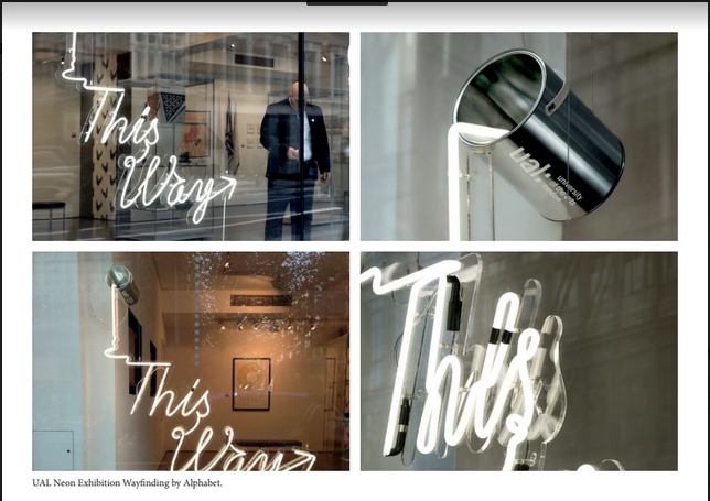
Megan researched some existing successful wayfinding systems, these were interesting and experimental but also realistic. We wanted to create something for the system that wasn't unrealistic or asking too much - this was to prove that a powerful wayfinding system can be made within reason. There was a particular focus on the neon lighting that Megan found, this was because the University uses a lot of neon lighting and was eventually something we took forward.


Holly - Survey Research

For part of the research Holly created a survey to assess opinions on the current wayfinding system and the types of things that inspire creative students. Nature was by far the most popular result here, this lead us to want to incorporate nature into the final wayfinding system. Colour was also a popular result. The current style of the uni is very white and bland - we wanted to research and explore different ways that colour could be brought in on a big scale within the university.