Sunday, 21 April 2019

The Door into Shadow - A Live Brief

The brief was a commission to create a book cover (front, spine and back) for 'The Door into Shadow' by J.I.Thacker, the first in a line of six novels. The cover needed to feature a bold image, the authors name and the title of the book, in a consistent style for a dark fantasy novel. It also needed to include reference to what number it is the Shadowland series (I), a blurb, a byeline and the 'Laptop Cat' publishing house logo, in a bold and memorable way.

Again there was strong communication with the client which meant that throughout successful alterations and compromises were made. In the end the book was physically published which felt like an amazing achievement. The feeling of having the physical book after having worked on it so long, createed a strong sense of pride and achievement. This is is something I will be able to use for my portfolio and on my CV I will be able to say I have had cover designs published. 


Laptop Cat Books - A Live Brief

This brief was to create a logo design for a budding self-publishing brand called 'Laptop Cat Books', to be used for books, business cards and other branding applications. The logo design needed to show a cat resting on top of a laptop, as per the client's request. The business is small and only run by one person, so the design needed to reflect a personal, characterful style.

The client was incredibly pleased with the logo design and we will likely work together again. In order to have a successful collaboration there was frequent communication with the client and each stage of the process he was sent variations to choose his favourite. It was important to honour his choices yet still discuss why certain designs may work better than others. Overall this was a very successful client experience.

The client only asked for a logo design but great lengths were gone to to expand on this idea and present the logo designs in the best way possible. The logo was printed on a series of business cards and a stamp was made to showcase the logo. This was to be used for packages and letters that the publisher may need to send. The business cards and stamp were placed in a box which I designed, again to improve the clients experience. I then wrapped the box in tissue paper, which had been stamped to exemplify the logo too. This all created a beautiful presentation of the logo and an extremely satisfied client.


Norwich Beer Festival Logo Design 2019 - Competition Winner

6B2/6D2

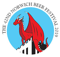
Since I won the Norwich beer festival competition in 2018 I thought I would enter again this year, given how much I enjoyed designing for the festival last time. After the designs were put to a vote, I won again! This was exciting news and will be excellent to talk about in interviews and my portfolio. The Norwich Beer Festival is a large event and as a lot of coverage as I discovered last year, so it will be good opportunity to further my reputation.


Having discussed with the Beer Festival team last year, I knew what they were likely to choose and the specific elements that would make the design stand out. I looked at previous years winners but also thought about ways the logo could look more modern and appealing. This was considering the recent change in direction of the festival and ensuring that I created a design that I was proud of and would reflect my own personal style and aesthetic.

After having won, I was emailing the beer festival organisers for several weeks. In these emails I remained polite, friendly and open to ideas. The management had several thoughts for how the logo could be changed so that it would look smoother and would stand out better on the beer festival glasses. They also wanted several alternatives to put on different coloured t-shirts. For these changes I made a series of alternative logos and organised them in a pitch deck which I emailed over. Within this pitch deck I offered all the alternatives they asked for and offered a few more alternatives too - this was to show I had considered their advise and wanted to improve the design. That being said, I also didn't want to overwhelm them - so kept the options, clear, concise and considered. I ended the pitch deck with the logo alteration I favoured most, making it appear as the best choice. This worked well and they chose a variation close to my favourite design.


After this they still wanted several changes, so I made sure to offer my help in any way that I could. The team offered to have their own designers take over the logo work if I didn't have time but I wanted to gain the experience and to encourage them to want to work with me again in future. This meant that I came across as a professional and hardworking individual. And as a result, the team suggested that I should be able to help with the design work of next year's festival. This will be a brilliant opportunity and is a result of my hardworking and professional conduct with the team.


Leeds City Art Guide - A Problematic Collaboration

6B2/6D2 

The brief was to create a magazine celebrating Leeds art scene for a photographer within the university. The purpose was create a visual guide to student life, painting Leeds as a city with an interesting and alternative creative scene. The main objective was to highlight the student's photography and present it in the best possible light.

I was put in touch with this student by a mutual friend. We met for lunch and discussed the brief together and the kind's of things she wanted and her general aesthetic. I entered the meeting with several questions about the audience, it's purpose, where it would be sold/picked up and things like that. The main issue with this meeting was that the student did not know herself really what she wanted for the publication. She had a collection of photographs which were all loosely tied together with no accompanying information or theme. They were images around Leeds but nothing more specific than that. This should have been a warning signal for me as without much direction, I was approaching the project using guess work. She also contacted me quite close to her deadline, because the designer she'd contacted previously had dropped out (I found out later). This limited timescale was also a concern yet still I took the project on - believing I would use it as an extended practice project.

I found I was doing a lot of research about the places she'd photographed - trying to link them together into a guide format - whereas I should have been spending more time on the design work. This did not feel like a collaboration, it felt like something I had to fix. I didn't feel excited by it, I felt stressed. After doing some research, I formatted the images into a contemporary magazine, giving the images title pages and filling the space well. I sent this over to her and she only wanted moderate changes - which seemed good. However, a few days before her deadline she read the brief that the photography department had set her for this publication, for the first time, and realised that our publication did not match the criteria. It had too many pages, not enough images and was not the correct size. As a result I found myself spending the day/evening in the photography studios trying to recreate the publication to the correct standard, with very little input by the photography student though-out. The end result was something I was not proud of but it met the requirements and was an achievement given the pressure of getting it done.

This debacle could have easily been avoided if I had seen this brief in our initial meeting, but mistakenly I had assumed she was providing me with all the information she had. From this experience I have learnt several things which I will be using in future collaborations/commissions:
  • To accept the brief only if I believe I can do a good job within the time given, without digging into my personal life/free time.
  • To enter into the initial meeting with a list of very specific questions about the brief - similar to HAWRAF (write this in future).
  • To be direct with the client/collaborator, tell them exactly what I need if they have not given me enough and force them to make decisions so I can create good work.
  • To not act as their graphic design mule if I'm not being paid! This collaboration was uni based and so I was not paid for it. However, in the last stint when I came in the day before her deadline, I was only there to help her get the project done - it was no longer my responsibility and this was more like a favour. Which would have been fine if I had been treated with more respect. I hope to ask her for photography assistance in future so that this debt is returned.
  • To set out ahead of time what will happen if the project needs last minuet changes -what this will cost and at what point this cuts off. I am the kind of person who would usually want to help finish a project in any way that I can, in order to make it high quality and build a good relationship with the client - yet I need to decide when ENOUGH IS ENOUGH.
As a result I have not used this project for Extended Practice as the design did not come out as I had hoped. Throughout I felt strained and this can be seen in the final outcome of the design. I have found that it is most important to know exactly what the client wants before entering into any kind of engagement. This has been a very shaping experience.


Sunday, 7 April 2019

It's Not How Good You Are, It's How Good You Want to Be

 In second year a visiting professional suggesting that the book 'It's Not How Good You Are, It's How Good You Want to Be' is amazingly motivation and brilliant to reference. So this year I decided to read it hand have listed below the chapters I found most inspiring.

Try things!!

Designing is about deciding the narrative.

Importance of networking!

(relevant to PPP presentation - need to think more about imagery)