Overall this module has gone well. I have learn't a lot about the graphic design industry and how I can work my way into being a part of it.
Throughout this project I have learnt the importance of gaining new experiences and seeing creative work whenever I can. I have been to several exhibitions and been a part of one, which has opened my mind to new art forms and introduced me to other creatives. Berlin was an incredible experience and gave me a real insight to what is like to work professionally within a studio. Seeing designs has given me a drive for the future and an insight into the steps I need to take to get there.
The creative report was by far the most useful aspect of this module. The advice given to me by creatives I admire was perfect and unique, it really motivated me to work with passion and drive. One of the best bits of advice both Ali and Rea gave me was to read more, which is something I have sincerely taken forward. Talking to them has really given me the confidence to contract creatives in the future and maintain contact too.
The 'Life's a Pitch' project was also a useful task as it meant that I could practice skills in collaboration and compromise. I think I worked well within the group, offering up ideas and solutions at every opportunity and contributing work consistently. We made sure the pitch was concise and articulate, with much research backing it. I didn't present as we had stronger presenters in the group, however this is something I really want to work on.
In fact, the final presentation was something I really struggled with. I found it easier in first year, which could have been because we'd had more practice in first year or because I was more confident about the work I was describing then. I think the key to a good presentation is to fully believe in the work you're communicating, which I didn't this time round. In future I hope to organise the sequence of my slides better and to spend more time rehearsing. With enough preparation and practice I hope presenting will be easier in future.
Sunday, 20 May 2018
Saturday, 19 May 2018
Studio Brief 2 - Feedback
The feedback for our presentation was mixed. It was acknowledged that we did a good level of research, which had clearly fueled our idea generation. However, it was suggested that we should have identified more specific problems within the institution and then presented our ideas as solutions.
Another point was that our 'Arts and Crafts' approach was good because it played into the institutions love of heritage. However, it was also suggested this theme ignores the technological future we seem to be speeding towards. In order for the new building to be applicable to future generations, we need to prempt that people will be looking for technological environments.
Overall it was also said that the pitch was well presented, thanks to Holly and Jasmine. However the feedback also says it was 'under presented', it could be that this was because we didn't delve deep enough into our ideas. I might be inclined to disagree with this, as all our ideas were thoroughly discussed, explored and researched beforehand, and in the presentation they were refined into concise points.


Friday, 18 May 2018
Studio Brief 2 - The Pitch
We then put the presentation together and Holly and Jasmine presented it. This went well, they were articulate and consise about our ideas! We practiced it several times before the performance, which allowed us all to make sure that Holly and Jasmine conveyed our ideas. Each slide we ensured were very picture focused with minimal writing just to surmise the points. The last slide of summary was particularly helpful to round it off.


Studio Brief 2 - Wayfinding Tree Development
For the wayfinding we decided to have a tree made of colourful strip lighting that would direct people around the university to the course they wanted to go to. Jasmine and I had a long discussion about this whilst walking around the collage and the technicalities of how this would arranged. We walked around the university and made sure that the trees would make sense. Originally we wanted to have strips that would line the ceilings, however we realised this wouldn't work and inside we would have trees that had the lenghth of lines represent the distance needed to travel. E.g. Blue = Photography and this is the furthest distance to travel because the line is longest.


Studio Brief 2 - Confirmed Ideas and Development
Because we'd decided to have an Arts and Crafts theme, we began researching this. The key features were the patterns, the use of light, metal frames and nature - these were all translated in contemporary features for the university. After that we began deciding on all the different aspects we had discussed and how these would be visually represented in the presentation. These elements included:
One of our main ideas was to add frames of glass over the windows, creating a stained glass light experience - with the tiled theme of the Arts and Crafts movement. I created these from a leaf shape that was replicated and altered, each colour taken from an Arts and Crafts colour pallet.

I then also began to creating experimental room numbers to give an idea of how these would be organised in the building. We realised that the currents numbers were mismatched and disorganised and a new system could be far more successful. One of our main ideas was to have the numbers in relation to the course, so for example 1 = Graphic design. So the first room you come accross in graphic design would be 1.1. However this was considered too ambiguous, as the 1 could still represent floor 1 - so this was altered to be a G instead.

After some discussion it was mentioned that having multiple colours could be too confusing and the course colour (graphic design = red) should be the main focus of the tile. So we experimented with making it the background colour and the leaf colour, and just the background colour. However I thought neither of these worked - they didn't stand out enough. In the end the white background felt bolder and more in keeping with the white university aesthetic - especially if these were to eventually be produced as ceramic tiles.


- Plants.
- Stained glass.
- A colour organised wayfinding system, including a tree with coloured strip lighting and patterned tiles for the room numbers.
- Patterned furniture and lights with metal frames - similar to original Arts and Crafts design.
One of our main ideas was to add frames of glass over the windows, creating a stained glass light experience - with the tiled theme of the Arts and Crafts movement. I created these from a leaf shape that was replicated and altered, each colour taken from an Arts and Crafts colour pallet.

I then also began to creating experimental room numbers to give an idea of how these would be organised in the building. We realised that the currents numbers were mismatched and disorganised and a new system could be far more successful. One of our main ideas was to have the numbers in relation to the course, so for example 1 = Graphic design. So the first room you come accross in graphic design would be 1.1. However this was considered too ambiguous, as the 1 could still represent floor 1 - so this was altered to be a G instead.

After some discussion it was mentioned that having multiple colours could be too confusing and the course colour (graphic design = red) should be the main focus of the tile. So we experimented with making it the background colour and the leaf colour, and just the background colour. However I thought neither of these worked - they didn't stand out enough. In the end the white background felt bolder and more in keeping with the white university aesthetic - especially if these were to eventually be produced as ceramic tiles.


Thursday, 17 May 2018
Studio Brief 2 - Idea Generation
Whilst we were researching, we began by making mindmaps of the distinctive features of the university and immediate ideas for the wayfinding. This proved helpful to spark some inspiration. The ideas were vague and didn't have concrete themes yet, but it was success to get the ball rolling.


After we collated our research together, we each individually began generating ideas. Here is a mindmap I made of themes I thought we could focus our concepts on.These mainly focused on the moodboards I made and ways these could be visually represented.

Then we came together as group and discussed ideas, bringing them together and defining what we thought would be most successful. Eventually we decided that our focus would be the Arts & Crafts movement which was the basis of the university, we also wanted to incorporate nature and light under this.


Tuesday, 15 May 2018
Studio Brief 2 - Research
Work I conducted:
Leeds Arts University
History
Leeds Arts University
has been around since 1846 when Leeds Mechanics Institute merged with
the Literart Institute creating Leeds School of Art. Coming together
at Vernon Street in 1903 to evolve heavily influenced by the Art and
Craft movement – could this be a style we develop to connote the
roots of the university. Could we introduce stained glass features in
this style playing on the use of lights and windows?

Henry Moore and Barbara
Hepworth enrolled 1919 and 1920 – could this be something else we
celebrate within the collage. Perhaps we could have one of their
pieces as a main feature – or work by students inspired by the two
legends.
In 1950 the Basic
Design course was created and a more scientific approach was
encouraged in the students – so they could gain capacity for
constructive criticism and understanding. Could the aesthetic of the
new building focus on the order of creativity – objectivity/ how
science can create art. Although in 1960 courses were made which took
a more open minded, flexible approach.
Between 1968-93 the
college was named Jacob Kramer College after a leading alumni who was
famous for oil paintings. Many of his subjects have been painted with
black eyes – could this be a feature, or perhaps could prints of
his paintings be showcased.

In 2017 university
status was granted – making them the only specialist arts
university in the North of England!
University Moodboards:
Another of my roles was to create moodboards to explore the different aesthetics of the university. This included a more colourful compilation, a bold black and white exploration, a blue themed design and finally one focused on the people you find at art school. A particular favourite of mine was the black and white design, the mirror imagery seemed particularly interesting - I wondered if maybe there could be a form of wayfinding that involved reflected and distorting imagery.


Jasmine - Current Wayfinding
Jasmine worked on the current features of the building, analysing what works well in the building and what could be improved. Whilst walking around we took a lot of pictures, of the wayfinding but also the distinctive features of the building - what defines it. This lead us to realise the best parts of the university have lots of light, with high windows, creating a motivating working environment. This was something we explored later on.


Megan - Wayfinding Examples
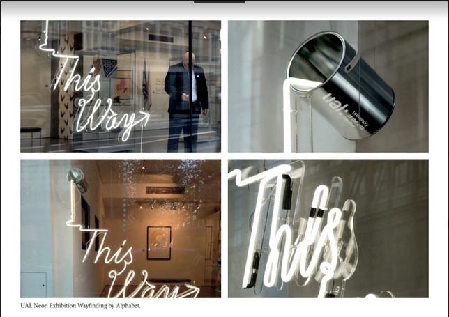
Megan researched some existing successful wayfinding systems, these were interesting and experimental but also realistic. We wanted to create something for the system that wasn't unrealistic or asking too much - this was to prove that a powerful wayfinding system can be made within reason. There was a particular focus on the neon lighting that Megan found, this was because the University uses a lot of neon lighting and was eventually something we took forward.


Holly - Survey Research
For part of the research Holly created a survey to assess opinions on the current wayfinding system and the types of things that inspire creative students. Nature was by far the most popular result here, this lead us to want to incorporate nature into the final wayfinding system. Colour was also a popular result. The current style of the uni is very white and bland - we wanted to research and explore different ways that colour could be brought in on a big scale within the university.

Life's A Pitch - Studio Brief 2
The Brief:
'We are now heading toward a new image as Leeds Arts University and we are expanding into a new extended facility (building). A new logo has been created by Peter and Paul in Sheffield. This brief is to create a wayfinding and imagery for the building and the various courses and facilities. I will attempt to gain plans and elevations to aid this. The work should cover all areas of this wayfinding and human interaction and will be to proposal level. A rationale of who and where we can connect with staff, visitors and students.
This investigation should be as wide and exciting as achievable, there are NO restrictions and how this is achieved is down to research and awareness of what wayfinding is, externally accessed maybe, do not get bogged down with detail unless you feel it is important. Consider BIG IDEAS and try to be innovative, creative in all areas. As mentioned, manufacturing is NOT essential, concepts that cover the brief in the most 'fresh' creative and reasoned way. Your presentation at the end of this can be pdf (deck,,,if you aren't aware of this term, find out).
Presentations are up to the groups how they are presented and a considered 'rationale' is needed. This is a really 'native' brief and you will need to note all work on your PPP Blog as you go with a final post that sums up your individual take on this project together with your take on the 'collaborative' aspects of this brief.'
Plan of Action:
We began by assigning different roles for each group member, this is to ensure we all contributed evenly and every aspect of research was covered.

Creative Report - Visual Outcomes
As a response to my
findings from the creative report. I decided to create a short
cartoon for each artist. This allowed me to visually analyse their
responses and think about them with consideration. The cartoon style
is a mix of both Brian Rea and Akbar Ali's work, Brain Rea having
more playful illustrations and Akbar Ali specialising in cartoons.
I read several books on
graphic storytelling and comic book art in order to create an
informed piece. This was because both illustrators suggested to me
that I read as much as I can, and this is what I intend to do! These books included:
- Foundations in Comic Book Art by John Paul Lowe
- Graphic Storytelling and Visual Narrative by Will Eisner
- Pictures and Words by Roanne Bell and Mark Sinclair
The
cartoons I produced are simplistic but they were a nice introduction
in to the field, it is a practice I really want to work on over
summer. I hope to send these to the illustrators as a form of thank you for answering my questions.


Subscribe to:
Comments (Atom)