Tuesday 7 May 2019

Skills Evaluation


Throughout this module I have developed many skills which will help my future career as a designer.

I have learnt skill in communication with professionals and developed methods of contact with them. I know how to construct flattering and persuasive emails and cover letters and organise meeting with designers which could potentially lead to more experience. I am familiarised myself with other avenues of contact, such as sending things in the post. I have designed packs which I will send to studios in future. I have also learnt not be fearful of rejection. This is common part of the industry as it is flooded with people trying to get experience. It has made me realise the importance of being friendly and open in all potential business encounters, just in case there could be future opportunities to be had.

From a bad collaboration my skills in confrontation have developed. The collaboration went incredibly badly and I was messed around a lot. In future circumstances I will first initially establish what the ground rules are and what will be required from me, with a clause stating what will happen if the brief changes. Then if I am asked to do much extra because of miscommunication, I will be more assertive and outline when ‘enough is enough’. This has really improved my confidence skills.

I have learnt methods of projecting where I want to be in my future and strategies which will help me get there. In my case I have decided that I want to be an in-house graphic designer for a museum or gallery, so I have organised a plan which will help me get there.

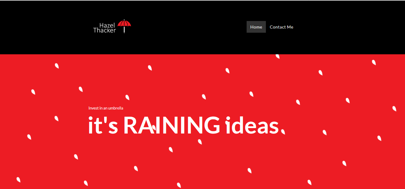
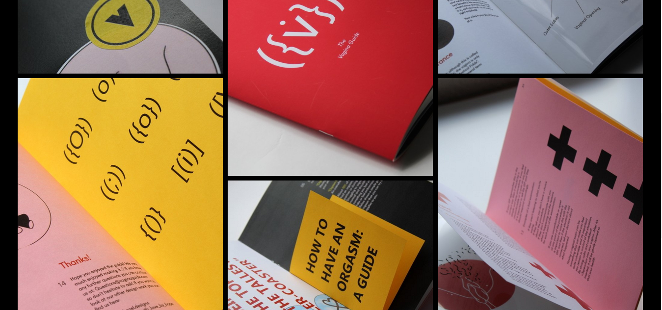
I have learnt a lot of skills in presenting my work and ensuring that it is consistent. I feel a lot more professional as a designer now and have branding which I feel perfectly reflects me.

Finally, I have learnt skills in networking. From my work experience I established many different relationships with a variety of different practitioners and this has led to future collaborations and pieces of important design advice. From now on I hope to always put myself forward, even in intimidating situations, and forge links with potential clients, collaborators or associates.

Sunday 5 May 2019

Manifesto

In the future for my career, I want to one day work as an in-house designer for a museum or gallery. This mission statement will outline the ways I will eventually get to this stage of work.

After summer I will be moving to Coventry so I plan to get into contact with design studios in and around Coventry, including those in Birmingham and send them pieces of my work to announce my arrival. These will be accompanied by a cover letter which will outline my offer of work. I will be contacting these places early on so I can potentially do several studio visits and build a relationship with the studios. Working in a studio will be good design practice and should improve my general skills and merit.

I will also be contacting three different galleries in and around Coventry, including the Herbert Art Gallery and Musuem in Coventry, Birmingham Museum and Art Gallery and the Barber Institute of Fine Arts. I will be requesting to volunteer in each of these galleries and I will hopefully secure a volunteering role. This will mean I can build up my knowledge and experience of gallery origination and potentially work my way into meetings with the designers - as I did in my work experience. This should lead to further roles within the design aspects of the galleries, if I am confident with my willingness to help.

Whilst I work, I also plan to build up my portfolio full of relevant gallery and exhibition work. This will give my designs purpose and hone my skills. It will also mean I am constantly posting work which could potentially gain traction. I also plan to conduct collaborations with other creatives in order to push my work and create connections - which should also open doors.

Thursday 2 May 2019

Move to Coventry Next Year - Gallery Research

For my career I want to eventually work as an in-house designer for galleries and because of this I researched galleries in and around Coventry. This included the Herbert Art Gallery and Musuem in Coventry, Birmingham Museum and Art Gallery and the Barber Institute of Fine Arts. I began thinking about ways I could get in contact with these galleries and show them my design to potentially forge a connection with their design teams.

I decided to make a calendar which would feature art galleries from around the UK and specifically feature these three places. This way the calendar would be placed up and around the galleries as a functional object, and potentially gain some traction. The calendars produced also feature other art galleries which I am interested in so I could potentially send it to these places too.

Originally the calendar was screen-printed in order to cheaply mass produce it. However this process damaged the designs and cause some important detail to be lost. I resolved to print them digitally instead, costing more money but creating a far more professional finish which should be attractive to designers.

The calendars will be send in packs with my business card and a cover letter, announcing my arrival into town. These will be sent out after the deadline so I will have time to produce the calendars and write personal cover letters to each institution.


Wednesday 1 May 2019

Move to Coventry Next Year - Studio Research

 6B2/6C2/6D2

For personal reasons, I will be moving to Coventry for a year next year. As a result I have been researching studios in the surrounding area - especially Birmingham. I plan to put together packs of my personal branding to send to this studios, including my miniature portfolios to announce my arrival and availability. These packs will be sealed with my personal branding stamp too in order to enhance the experience for the studios.

An Endless Supply - Unit 3 Minerva Works, 158 Fazeley St, Birmingham B5 5RT

Two of Us - Ash O'Brien +44 (0)7736 871 852 ash@twoofus.co 

The Curious Agency -  4A Belmont, Shrewsbury SY1 1TE

Fluid - 12 Tenby St, Birmingham B1 3AJ

Studio D8 - hello@d8.uk

I will be spending the summer in Norwich so I also research two studio I could potentially do a summer placement at.

The Cl!ck - 59 Kerrison Rd, Norwich NR1 1JB

Maddison Graphic - 3 Raven Yard, Norwich NR1 1PQ

Monday 29 April 2019

Evaluation - Studio Brief 1: Personal Branding

The branding logo is bold, memorable and well-reasoned. It was important to have a fairly simple logo so it could be appropriate for a multitude of different design studios/roles. After graduation I hope to be open to many different kinds of design jobs in order to gain all the experience I can. That being said it would be preferable to be a member of a smaller, quirky studio and so the logo still indicates creative flair and imagination.

The branding reflects my style of design, which tends to be bold shapes and refined colour pallets. Red is used a lot in my work and so it made sense to use it within my branding. This is balanced nicely with black and white and creates a striking and contemporary aesthetic. The colour makes the cards exciting and eye-catching. The bold style and colours used are similar to the studios I initially researched and therefore should be appealing and interesting to them.

The logo shape shows that I am good at idea generation, through the text inviting the holder to a brain-storm. The pencil within the umbrella also indicates that I am good at the preliminary planning stages of design work. The unusual interpretation of the every day umbrella helps to reflect that I enjoy quirky and imaginative design. Yet it is still refined enough that it could also be suitable for more serious work. By stating that I am a 'graphic design, illustrator and brain-stormer' it shows that I can be playful and may stand out against other more basic design titles.

All the different items of physical branding have been well reasoned and should make me attractive as a designer. The miniature portfolio particularly works well to give a taster of my work and will stand out against the usual digital submissions people receive. The case which has been designed to hold it also improves the experience - it gives a sense that the portfolio is something important and raises it's value. The case's size also means there is space for a bookmark and business card to be part of the pack. The bookmarks are likely something that people will keep, even if they discard the rest, as they are functional. This means that as they are used, people will be reminded of my branding and will remember to contact me for work. The business card holder will improve my appearance as a professional designer at networking events or studio visits. I will be able to keep the holder in my bag and then slip it out when necessary to hand out business cards when necessary. It also means that the cards are protected from any damage. The stamp is also consistent with the rest of the branding and will be useful in various types of communication with clients and studios. Clients in particular will be charmed by the stamp and may choose to do work with me again in future.

Most importantly the design work is consistent across all modes of dissemination – including my portfolio, website, social media and branding. This was important to give a united front and to show that I am organised, consistent and have a recognised way of working to offer people.

Wednesday 24 April 2019

Final Design - Studio Brief 1: Personal Branding

6B2/6C2/6D2

The final printed branding has come out incredibly well. The designs are sharp, bold and crisp and the colour scheme is consistent across all the items. The business cards, business card holder, bookmarks, mini portfolio concertina and concertina case have all been printed on a thick matte stock. This is soft to touch and is immediately satisfying and professional, it means that the colour is rich and striking for the viewer. In order to use this stock the business cards are 1 sided, but this was worth it. The designs don't appear crowded and lay out the information simply and professionally. This all means that anyone I engage with will take notice of my name and design work.

The rest of the branding works well with these pieces and are consistent. The website, my social media and my portfolio all share this aesthetic and red, white and black colour scheme.


Tuesday 23 April 2019

Logo Stamp - Studio Brief 1: Personal Branding

6B2/6C2/6D2

A stamp was made of logo in order to be another avenue of branding. Using for letters and packages to potential clients and studios will create a more personal and authentic experience. It creates a beautiful inked texture which will reflect my quirky and sometimes traditional nature style. This will be used on the packages of work I send to Birmingham studios.

Uses:
  • Top of CV/cover letters.
  • Envelopes when I send studios packs of my work.
  • Inside of publications.

Monday 22 April 2019

Portfolio - Studio Brief 1: Personal Branding

6B2/6C2/6D2

My portfolio was then developed using the branding. The images used were refined so they were clear, crisp and professional.
  • The colour scheme of my branding is shown the images with red backgrounds. These are exciting and vibrant.
  • My logo has also been placed in the bottom right corner to reinforce my branding.
  • Then on the left there is my name, title and contact details. This has been made fairly small so as to seem considered and to not distract from the project shown on each page.
  • Only 4 projects have been developed so that the viewer doesn't get bored or overwhelmed by the work they are seeing.
  • The titles have been made quite large to suggest their importance and to give the porfolio some hierarchy.


Social Media and Documenting Work - Studio Brief 1: Personal Branding

6A2/6C2/6D2

My social media account was also refined to reflect my personal branding. I decided on an aesthetic which would use a variety of different formats but given consistency by a rigid colour organised grid. Black and white images were to alternate with red, black and white. This created an interesting constraint as sometimes the work being produced was not of either colour - it became about how to frame it in a way which would make it fit the regime.

Since updating my social media it has grown a lot more popular. I am planning what I am going to post quite far ahead in order to ensure that the colour scheme can be followed and the different posts compliment each other. The variety of formats creates an interesting an imaginative mix which matches my style as a designer. Many of the studios I looked at for inspiration also adopted similar layouts so I thought this style had relevance.


After talking with Alec and hearing about Commission Studio's technique of documenting work, I realised I need to take a different approach to how I was recording my designs. Here it shows how Commission Studio have created a logo and then presented it a completely unusual way in order to capture interest.


I then adopted similar techniques of documentation for some pieces of my work. Such as similarly making a logo design into a stamp and then photographing the impressions of the stamp. There was also some images taken in a supermarket of a student shopping guide to frame it in an unusual and relevant context. Finally, some photographs were taken of a poster series on an overgrown wall - rather than on a white background. This was again to make them a little different and to reflect the 'imperfect' nature of the prints


Re-Design of Website - Studio Brief 1: Personal Branding

 6C2

After feedback on my previous website it was developed to resemble my current personal branding.

https://www.hazelthacker.com/

Changes:
  • Red, white and black were used through to keep it consistent with the branding.
  • The logo in the top left was rectified so it would link to the home page across all of the pages.
  • The information on the initial page was cut down so it would be less overwhelming for the viewer.
  • The projects were also cut down to more specific and consistent pieces of work.
  • The way these were presented was also edited, so that they would be consistent across all projects. They were given red backgrounds with drop shadows to create consistency and emphasis. 
  • One of the main pieces of feedback was that the projects needed to have better, higher quality imagery. So better digital arrangements were made and time was taken to perfect the photographs. Some of the projects were put into context as Christopher Morby from Commission Studio suggested. 


Sunday 21 April 2019

Developed Business Cards - Studio Brief 1: Personal Branding

The business cards were then developed to have a red, white and black colour scheme, this was a lot more similar to my design style and previously established aesthetic. Three variations have been made to compliment each other and potentially be noticed in networking opportunities, particularly if I am talking to groups of people.


The nets were also refined and developed to follow the new colour scheme. The number of raindrops was reduced in order to create better focus on logo itself. Each piece of design contains one of the statements developed, such as 'it's raining ideas' and 'lets brainstorm' so the designs remain quirky and aren't too serious.

Initial Print Outcomes - Studio Brief 1: Personal Branding

The initial print-outs were bold, bright and consistent with each other. They were printed on a soft matte stock which created a luxurious and tactile feeling for the person receiving the cards. They worked well and from feedback it was suggested they were very professional. However, I found they didn't quite reflect my style of design. I often use striking colours and and minimal colour pallets - whereas these designs seemed to use too much colour. It was decided that it would be developed further so that a red tone was explore with the black and white.

I also found that on the double-side business cards the colour hasn't come out as well. This is because to print double-sided in digital print they use a laser printer - which can be more 'streaky'. I resolved to created one sided business cards, so they could be printed using a better stock and the more industrial inkjet printers - so ensure that the cards had a more professional finish and colour.


Personal Branding Nets - Stuidio Brief 1: Personal Branding

Different nets were developed for other applications of the personal branding. This included the business card holder previous mentioned, in order to have more of a professional front at networking events. It also included a 'miniature portfolio' concertina and case. This was an item which I will be printing and distributing to different design studio in Brimingham so they can have a small flavour of my work. Printing something physically often creates more traction then sending something digitally as it is less expected and more personal. Bookmarks were also developed as items to send to potential studios. This was so they could keep and use the object but be reminded of my branding whenever they see it. It also links to be interesting in publication making and ties with publishers.

Business Card Experiments - Studio Brief 1: Personal Branding

Some business cards were the experimented with. These used a black and white approach with a simple uses of colour for the rain falling onto the umbrella. These have designed to be friendly, imaginative and engaging. The umbrella particularly stands out well in white on the black designs. But both variations have been taken further and printed since they compliment each other well and further the collection.


Various Experiments:

Some of the designs initially made felt too simple and didn't reflect my imaginative and friendly personality. It needed an element like the rain to add another layer to the composition and further exemplify design skills.

There was also going to be a design which involved having the umbrella cut out at the center of the card with acetate behind it. However this proved to be a complicated process and the experiments I conducted did not have a professional finish and so were discarded. This is something I would like to test in future instead to exemplify skills in different processes - such as laser cutting.