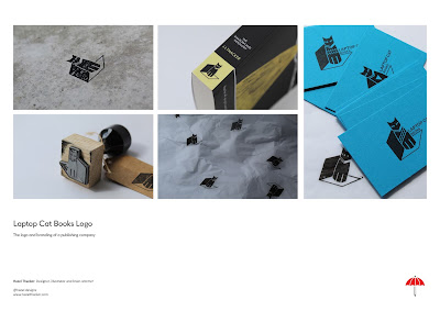
My portfolio was then developed using the branding. The images used were refined so they were clear, crisp and professional.
- The colour scheme of my branding is shown the images with red backgrounds. These are exciting and vibrant.
- My logo has also been placed in the bottom right corner to reinforce my branding.
- Then on the left there is my name, title and contact details. This has been made fairly small so as to seem considered and to not distract from the project shown on each page.
- Only 4 projects have been developed so that the viewer doesn't get bored or overwhelmed by the work they are seeing.
- The titles have been made quite large to suggest their importance and to give the porfolio some hierarchy.


No comments:
Post a Comment