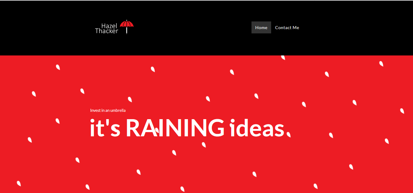
After feedback on my previous website it was developed to resemble my current personal branding.
https://www.hazelthacker.com/
Changes:
- Red, white and black were used through to keep it consistent with the branding.
- The logo in the top left was rectified so it would link to the home page across all of the pages.
- The information on the initial page was cut down so it would be less overwhelming for the viewer.
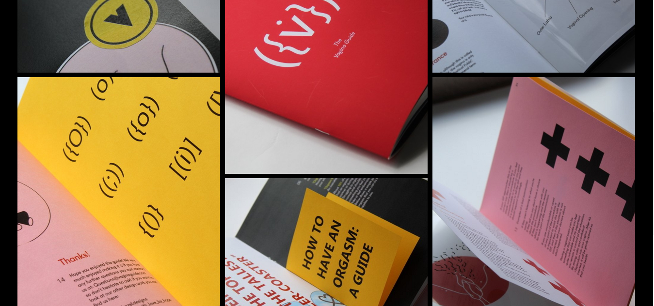
- The projects were also cut down to more specific and consistent pieces of work.
- The way these were presented was also edited, so that they would be consistent across all projects. They were given red backgrounds with drop shadows to create consistency and emphasis.
- One of the main pieces of feedback was that the projects needed to have better, higher quality imagery. So better digital arrangements were made and time was taken to perfect the photographs. Some of the projects were put into context as Christopher Morby from Commission Studio suggested.


No comments:
Post a Comment