Sunday, 31 March 2019

Lunch With The Hepworth's Graphic Designer - Rachel Oliver

In order to speak to the Hepworth's graphic designer, Rachel Oliver, I asked my supervisor to put me in touch with her. This meant that she was more likely to respond as I was being referred by a trustworthy source. I sent her an email explaining how I admire her work and would like to learn more about her practice and get some advice. In the email I was polite and flattering, I also kept it fairly informal with a smiley face and emojis in the subject line - this was to make sure the email reflected my personality. She responded immediately and we arranged to meet the next day. I was nervous for this, but the meeting felt incredibly mature and I found it easy to view her as an equal as we discussed design.


Rachel Oliver has worked in some truly aspirational places such as the V&A and at 20:20 in New York. We discussed that in every piece of work she does she needs to find a driving force behind it, otherwise she becomes incredibly bored. As a designer you cannot be complacent. This was important for me to hear and immediately gave me a certain level of motivation. She suggested that to have success it's important to read a lot about design and heavily research grids, which are also two things I hope to improve in future.

She suggested that when I move to Coventry, I should send things to people in and around the area - including Birmingham. She said to make sure my personal branding and Instragram is of a high standard. She also suggested I should offer to do pieces for free and make contacts in any way possible - these are all things I will adhere to.

We also talked about our own projects and she gave me some interesting advice about design for exhibition posters which has influenced my own practice. She suggested that adding a coloured filter over a photograph can heighten it's contemporary aesthetic and is often used for gallery branding. After this discussion I began noticing this tecnique more and more and adopted a varitaiton of it in my own work. We also discussed her work - and a garden catalogue which she has been tasked with. She said she was struggling with this, so I resolved to brainstorm some ideas for it which she could potentially use for inspiration - furthering our connection.

Meeting Notes

Notes for Rachel's Garden Book
I contacted Rachel again, asking her if she would be interesting in having me shadow her for a day or several. However, since she is only at the Hepworth 3 days a week and doesn't have much desk space, she had to decline. Instead we met up for lunch again to discuss out work further. This was again very beneficial and as a result I have made a useful connection. She also said that if there was ever a need for an intern, she would be back in touch.


Overall this has been a very beneficial and motivating experience. It has given me a better idea of what being a designer for a gallery is like and Rachel's experiences have given me something to aspire to. I hope to work with her in future one day.

Work Experience - Volunteering at the Hepworth

For my future career I hope to work as an in-house designer for a gallery or museum. This is because I have a passion for museums and galleries and find their style of design exciting and meaningful. For this reason, for my work experience I contacted the Hepworth Wakefield for a volunteering role to familiarise myself with gallery organisation, set-up and design.

In order to get into contact, I sent them an email stating my general qualities and love of the Hepworth. That day they sent me an email inviting me to a volunteer social set for the evening. I decided to attend this. In preparation I did a lot of research on the Hepworth and also thought about my own experiences which I could discuss with the other the team and other potential volunteers.

This was an excellent networking opportunity as many other people who were interested in galleries were in attendance. It also tested my ability to converse naturally about my practice which went well, despite the fact I was nervous to begin with. I was also interviewed that night, after a successful conversation with one of the staff. This required some quick thinking in terms of responses, since I was unprepared for the interview. It went well however and I made sure to be pleasant and attentive. As a result I got the role. 

During this event, I made several contacts in the art world, two of which I am still in contact with; which shows how it was rewarding to go to this event. Of course, the volunteering meant I forged many more contacts later on.


Saturday, 30 March 2019

Outcomes of Work Experience - The Hepworth Wakefeild

Whilst volunteering at the Hepworth I learnt many different skills and forged important contacts for the future.

My main role was to be present in the gallery and be open and willing to talk about the art pieces on display. This meant I needed to have a foundation knowledge of all the exhibitions and had many interactions with members of the public. This was a very immersive experience and meant I had a strong knowledge of the gallery pieces. It gave me time to study each piece of exhibition branding and consider how I would change it myself to be more receptive to the public. I made many sketches experimenting with the alterations I would make.

During this time I also did a lot of networking with the other gallery volunteers. Many of these people are heavily involved in the art world. So it was interesting to hear about their events, ideas and opinions. It also gave me a chance to talk about my own practice and plans for the future. This got be comfortable with talking about my practice and style of design and also lead me to give some of them my business information for future design work for their events and other design needs. Many of the volunteers and gallery hosts had insights and advice about work within the art world too. They suggested people to look at and avenues into work. This was also extremely useful.

Whilst being there it also gave me a strong sense of gallery organisation and the types of roles they have behind the scenes. This means that I understand the complicated inner-workings well and when I am to work in galleries in future I will be familiar with the set-up and will also be able to offer alternate ways of working. This even led me to consider that I might be happy in one of the 'organiser' roles in gallery running and not necessarily just the design aspect.

Either way, this work experience will also be useful for the future when I look for work in other galleries. They are more likely to accept someone who has volunteered in a gallery before and therefore gives me some merit above others. Part of my plan for the future is to begin volunteering in a Birmingham gallery and then get familiar with the design team - allowing me to work my way up into a paid role.

At the Hepworth I made sure to contact the graphic designer there and meet with her for lunch. This turned out to be a very inspiring and motivating experience.

Work Experience in York Studios

6B2/6D2

Because of my interest in one day working as a designer for galleries and museums, I began contacting design agencies in York which offered specific design work for museums. This included 'Inchpunch' which specialies in museum exhibition design and 'Qualia' which does museum and heritage work.

The emails I sent were passionate, chatty and flattering. I also made sure I ended on something funny which would make my email stand out and show a bit of personality - stating alongside my design skills I can also make a mean cup of tea 'which you don't want to miss out on.'


After contacting Inchpunch, they got back into contact saying that they would be willing to give me a placement - however, they stated that there would be no direct travel routes to their home based studio. Their studio is based in an obscure town fairly far from York and when I looked further into travel routes and costs it seemed like it was going to be difficult. I contacted the studio asking if I could do a two-day studio visit and they didn't get back in touch. However, I will be in further contact with the studio in Summer and hopefully do a placement with them then.


I also had contact with Qualia, who did not have room for an intern but asked if I could send them my CV and pictures of my work after graduation - giving me a potential contact for the future.


Qualia's work for York Castle Museum

Nearly Getting a Placement at Penguin

6B2/6D2

One of my other thoughts for the future was to go into publishing. Because of this I decided to apply for a work experience position at Penguin. I made sure I investigated the company thoroughly so that my application would show keen interest and passion. I have been interested in their work experience position for a long time so I have also taken part in other Penguin programs which I could discuss.

I made sure it was chirpy, funny and enthusiastic, with clear knowledge of Penguin books and their brand.

Application:

------------------------------------------------------------------------------------------------------------

Tell us a little bit about yourself and what drew you to apply for work experience with us?

I am a final year graphic design student from Leeds Arts University and I have completed the penguin student design award each year. Working in a publishing house like Penguin would be my ideal job and I'm incredibly interested in the marketing and design of Penguin books. I read a lot and write stories too and have designed covers for self-publishing authors previously. I have taken part in your Bookmarks feedback website and I enjoy discussing and critically analysing your books. Your ethos is something I really resonate with too, your focus on inclusion and your #LikeAWomen pop-up bookshop are both examples of your progressive mindset. I would love to help add to this way of thinking as I am a proud feminist and advocate diversity. I believe getting a taste of working at Penguin would be an experience I would treasure for a long time.

What would you like to get out of your work experience placement?

I would like to become more familiar with the publishing industry and the processes involved in marketing and selling books. I want to learn more about business and working as a professional in a modern and progressive environment. I believe penguin is an inspiring and creative setting which would really motivate me to pursue my dream of working in this industry. I'm an incredibly creative and resourceful individual so I would love to test my abilities and hone my skills to specific tasks. I would especially like to learn about how campaigns for books are developed and the relationship between authors and the penguin team. I'm curious about all the different individuals that make up Penguin and I would like to learn about their routes into publishing.

You’re stranded on a desert island and can take three books with you. What have you picked and why

The first book I would take is 'I Capture the Castle' by Dodie Smith, this is my all time favourite book and is something I never tire of reading. On a desert island I would not feel as lonely with such richly detailed characters to hand. The writing is so honest and well-rounded it feels entirely like dipping into another life – although on a desert island perhaps I should be focusing on my immediate surroundings first? The second book I would take is 'Hera Lindsay Bird' by the poet Hera Lindsay Bird. This poetry book is something that entirely resonates with me, I have read it several times and made detailed notes in the margins. It contains such ludicrous metaphors that allow the imagination to cross into new ways of thinking – reading it is an entire experience which would definitely be added to by the heat stroke and dehydration I'd likely experience on a desert island. Finally, I would take 'Maus' by Art Spiegelman because Valdek's experience of the Holocaust shows remarkable strength and resourcefulness. I am entirely in awe of his courage, and would need such a role model when trying to survive on a desert island.

------------------------------------------------------------------------------------------------------------

Initially this application was turned down but I was encouraged to reapply. Then, several months later I received an email offering me a work experience position at Penguin as someone had dropped out.


This was incredibly exciting as Penguin receives thousands of applications for this role. However, unfortunately, to ensure the spot was filled this email was sent to several people and although my response was prompt, it was too late. 

From this experience I have learnt that my work and experiences have merit and it is possible to be noticed by big agencies such as Penguin Random House if you apply yourself. My application probably stood out because of the research I conducted and the time I put into Penguin projects such as their 'Bookmarks' site. It shows having a focus can eventually lead to good opportunities. I nearly didn't apply to this, but I'm really glad I did, as even though I didn't cross the final hurdle I still had some success. It has given me confidence and courage to apply to more things and contact more people in the future.

(It's also taught me to be constantly monitoring my emails for potential opportunities)

Placement Research

6B2/6D2

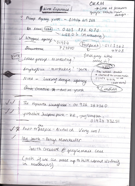
I began by doing research into studios in Leeds and York I would be interested in doing some work experience with. After making several calls however, not many seemed to be in the right position to provide work experience at the moment. I also found the studios weren't really the kinds of places I'd want to work for in future.

I contacted 'Print to the People' which is a traditional print making studio in my hometown Norwich. They were interested in giving me some volunteer work yet only over an extended period of time, rather than a concentrated period of a week or so. I would have struggled to commute to this each week so had to turn it down, but it does open doors for a potential summer placement.

I realised ideally I would one day want to be an in-house designer for a museum or gallery, or even designing as part of a studio for commissioned pieces from museums and galleries. This lead me to contact The Hepworth Wakefield and the Yorkshire Sculpture Park for volunteer work which both were interested in providing. I shortly had an interview at the Hepworth Wakefield where I discussed my experiences in the art world and led me to getting a place as a volunteer.

After having a discussion with PPP tutor John, he gave me the contact details for Ian Smith, the head of museums and galleries in Manchester. I asked him if he would be interested in getting a coffee or having me shadow him briefly - however, I got no response. 


Friday, 29 March 2019

HAWRAF Debrief

6B2

After having searched the Hawraf drive for resources we found interesting, we then came together as a group and discussed what we found.

Key Points Included:
  • Charging just for a pitch deck.
  • Tell everyone you're design super stars in the making - shout about it and people will believe it.
  • Search - Studio-Index for lists of studios 
  • Questionnaire for client needs to be purposefully engaging and easy to follow - allowing the client to feel secure and supported.  
  • Look at free business course - in admin section.
  • Look at press tips document too.

HAWRAF - Studio Rules

6A2/6B2

New members for HAWRAF are given a set of rules

These were called negotiables and non-negotiables.

Best Negotiables:
  • 'No interrupting. Granted, I’m not good at this one, but when everyone isn’t an active talker it’s not an effective way of communicating.' - Important to state, as everyone's ideas and thoughts can be heard. As someone who isn't very outspoken, this is something I appreciate. Equally it is important to speak up, if people are interrupting or overtaking the conversation.
  • 'Prioritize learning new things, new experiences, over what we already know. (The exception being if time or money is of the essence, and we must work within the known to accomplish our goals.)' - Good to state, your team should always be trying to push things and not become complacent. 
Best Non-Negotiables: 
  • A general list of important house keeping, including being in on time and tidiness. Important to have a functional work environment. 
  • 'Simultaneously, create and maintain boundaries between work, clients, and our own lives. Don’t answer emails on weekends. Don’t prioritize client “emergencies” that we don’t view as “emergencies.”' Important - as designers it's important to not get to involved in the work, a distance from it needs to be kept in order to keep making good, sustainable work.
  • High focus on communication, check in with each, give each other opportunities. I think this is really relevant for designers, as to be creative you need to feel comfortable. Some people may need to be given opportunities to talk to feel like they can. 
  • 'Ask for help when you need it. We can look out for each other, but we’re not mind readers. Expect each other to ask when they need help.'
  • 'Be willing to throw everything away. Be willing to abandon projects that don’t make sense, and rethink ones that seemingly do. Be flexible.' - this is key. Don't be protective over work, think about what is best for the brief and the overall studio's thoughts.
  • 'Practice saying “we.”' - Good for the company image, gives you power as a collective and the sense of backing and support.
  • 'Embrace risk. Don’t punish it. Make mistakes okay.' Better to do this than play it safe.
  • 'Leave the world better than we found it.'

HAWRAF - Discovery Questionnaire

6A2/6B/6D2

One of the interesting things that HAWRAF has, is a discovery questionnaire to brief clients with if they are organising a potential project.

This is particularly useful and I have recently been in a situation where I entered into a brief where the client wasn't entirely clear what they wanted and consistently changed their mind throughout. With something like a specific list of questions to begin with, this becomes far clearer and more straightforward.

ABOUT / TEAM
  • Who are you? What is your role? How long have you been there?
  • How long has the company been around? What’s its story?
  • How big is your team? What does it team look like?
  • Any other stakeholders or decision makers? What will their input look like? - Important to consider! There may be outside input from people with the money.
  • How have you worked with vendors/studios in the past? - Leads onto what the client may have liked/disliked previously - informs your own approach AND could indicate why they might not be the right client
GOALS / CHALLENGES
  • What have you done so far? What has worked? What hasn’t?
  • What are your challenges? - Get these out of the way so they aren't a surprise later on
  • What are you trying to communicate?
  • How would you measure success for this project?
GENERAL
  • Who are your primary and secondary target markets?
  • What’s your budget?
  • Where is your funding coming from?
  • Timeline?
All very important ^^^

BRAND
  • Do you have an established brand?- Any design work needs to be consistent with this. If the branding is too dissimilar from the studio's aesthetic.
  • Art direction? Photography?

HAWRAF - Studio Costs

6A2/6B2

After looking at HAWRAF's spreadsheet for how much they've charged their clients, there are several discernible trends.
  • Firstly that their conceptual design work they often charge more for, potentially because this is the most important part of their process and probably involves the most skill.
  • For smaller design agencies and artists they charge a lot less, which leads me to believe they have system for charging clients what they can afford. This is an effective strategy and shows the importance of charging for work, even if you aren't gaining much. These smaller projects are averaging around $40 a week, whereas the top clients have gone up to around $20,000 a week.
  • Marketing businesses usually have the most money to spend, especially large start-ups. The fact that the studio still works with a variety of clients is good though - showing the importance of variety and potential passion projects.
Looking at this spreadsheet makes me consider that the value of your work is decided by yourself, if you charge enough and with confidence people will believe you are worth that.


Selling Work and Being a Professional - 1.3.19

6B2

For this task we were asked to find an example of poorly designed branding and describe why it works - improving our skills in selling work to clients. I found a trucking company called - STD Limited.


Selling points:
  • People look at it, they laugh, it entertains them whilst they're driving and is memorable.
  • The T looks as if it is bouncing up, as if potentially on a truck journey - exemplifies the fast service.
  • The red colours of the letters stand out against the pale blue and are distinctive. 
Redesign:
  • Based on research the design shows a similar bold style adopted by competitors.  
  • Colours are bold and clear - likely to stand out whilst driving.
  • 'Steve's' makes the brand feel more personal and trustworthy.
  • Doesn't have STD in the title!


This exercise has shown that selling ideas confidently and cleverly is just as important as generating them. WATCH - Abstract on Netflix.

Regular Practice - Creative Convos - 22.2.19

6A2/6B2

Tom Finn and Kristoffer Søling did their masters together at the Royal College of Art. They first collaborated together when they did a poster for the typographic singularity. This worked well and lead them to do some for the Lonely Hearts Jazz Club which involved creating a typeface made out of heart shapes split into fours. They enjoyed recontextualising found typography in a contemporary context.

They suggest you should push work for future opportunities. They used any opportunity to do work they were interested in and eventually invested in a small studio space so they would feel like it was a job they'd take seriously. They share an enthusiasm for form and visual expression, they did rocket lollies which didn't have much depth but were quite playful - always think about the work you're doing and if it fills a gap in your portfolio.

Where does the work come from
  • Press/ End of year show.
  • Tinted Windows Publication - intervened in kickstarter to improve the quality.
  • Drawing Words Exhibition - Collaboration (hand-over) to Lauren Child - gave her own space to work on the curation - came from British Council.
  • Serpentine Work Marathon
When asked to do work create a tailored portfolio. Say you know what you're talking about and say you can do it for less.

Prepping for Industry - Some Thoughts
  • Nothing can replace good work - no shortcuts so put more time into your work.
  • Don't make a website in a night - focus on the way you're documenting your work.
  • Utilise your time in education to make interesting work - makes you different.
  • Stategise and customise your approach to people.
  • Go to stuff - be involved in talks and exhibitions. Get your personality as a human across.
  • Documenting work - make it into another project.
Regular Practice Jazz Posters

Bafic - Creative Convos - 22.2.19

6A2/6B2

Bafic is a filmmaker and photographer, who studied at Camberwell and works in London. Bafic is a name he works under, its his date of birth in letters

Bafic said that graphic design is at the core of everything and that it is all about process - structure, research and reasoning. Advice:
  • He suggests that depending on the room you're in extract the skills you have which apply and emphasise them. 
  • Focus on the story and the narrative - it's less about the product and more about the key message. 
  • The best way to develop something the client likes is to find out everything about them - the brand has to completely reflect that. 
  • If the brand is strong it's because they're controlled and are very careful about what they put out.
  • Industry isn't real - your clients could be the people sitting next to you. They are ordinary people. 
  • Piss people off who are older than you - this is how change happens. 
  • If you want to do something, just do it.
  • There are no rules, no defined rules - e.g. why is album art on Spotify square? Change it up!
Within music the melody becomes the hook and the lyrics are hidden underneath. Childish Gambino's America is so successful as all the different elements come together to make it special.

Bafic Directed 'PANES by Choice Errors - https://www.youtube.com/watch?v=36eXVRt1SaQ. Very resourceful in techniques used, some elements were filmed on Iphone. Similar for this NikeLab & Roundel video https://www.youtube.com/watch?v=1ZJGGNhb4IY.

For another video he used his brother's iphone which distorted the video - interesting use of constraints.

Something that really came through in Bafic's presentation was his passion and kindness - definitely important skills to have within the design business.

Sunday, 24 March 2019

Eva Cremers - Creative Convos - 21.2.19

6A2

Studied at Art Academy Minerva Groningen and then did a 5 month internship at Snask. This was small, crazy, creative and the office was full pink. Every time they have a new client they send a video saying how happy they are to be working with them. So she sent them a box of party stuff, all pink, acting as if she already had the internship - saying she couldn't wait for their responding video.This was incredibly effective and she got sent images back of the studio posing with the items, asking her when she could arrive. One of the projects there included photographing kittens in shoes for Adidas and she did the set design which was a completely new experience.

At university she made a wide variety of work, including 'The Happy Book' which used pop-ups, textures and mirrors. Also created push, make and play animations based on a self-portrait project. For graduation she researched Dutch newspapers, printed newspapers, shortcomings of newspapers and the shortcomings of readers. This was about learning how to imitate news today and in the end she created a wall of mechanisms to imitate the eye-catching and consuming effect of headlines - called 'In News We Trust'. All the viewers read these headline mechanisms, despite the newspapers on the side. This process involved setting goals, sketching, testing, improving, testing, questioning it  and making it.

After Uni

She read a quote that said you don't need confidence, you just need courage and you can't be safe and challenged. You can either be safe and bored or challenged and scared. So she boosted her Instagram and set herself her own projects to do, helping her to learn new skills.

This personal project lead her to having an interview with 'The Design Kids' . She was also asked if she wanted to be an intern for Man vs Machine, collaborated with Super Freak from Birmingham and the New York Times asked for a piece.

Things Learned So Far
  • Show your work online
  • Positive side to Instagram , lots of designers - every person is insecure about what they're posting.
  • Pinterest is training, shows amazing work and graphic design. You develop an eye for art direction and design.
  • Don't be afraid of big designers, they weren't born as great designers.
  • Being insecure about your work is normal, helps you be more critical.
  • There are people looking for nice talent.
  • Normal to have no idea what you're doing.
  • Exploring what you want/who you are
Tips for Traction
  • Look at other people's hashtags
  • Re-post stories 
  • Don't be afraid to comment on other people's work
  • Look at Greyscalegorilla tutorials
Workshop 

For this we created a 5 minute presentation for ideas for our end of year show, how this could be curated and pushed to the extreme. We decided to make our presentation about the 5 senses and did a lot of research into design pieces that incorporate touch, taste, sound, smell and sight.

This made me consider how our end of year show is a great opportunity to do some big and exciting work, especially as the attention received there could be good for networking.

Eva Cremers End of Year Show Work

Kieran Walsh - Creative Convos - 20.2.19

6A2

After graduating from Leeds Arts University he went to London and entered a start-up. Then he freelanced which wasn't so enjoyable and he's now working at Wired magazine, which focuses on how technology influences your everyday life.


Advice
  • Make a website.
  • Spell check your CV.
  • Make a work Instagram - employers use it to check you're who you say you are, if you're good and if you're nice. Make sure the aesthetic lines up with the jobs you're applying for.
  • Future proof your skills and think about what you'll need in the future. You're expected to be able to do everything.
  • Be a nice person to be around - compliment people.
  • Find an excuse to talk to that person.
  • Learn After Effects, Sketch, Vission etc.
  • Go to the signings/parties/talks/openings.
  • Get a nice email address - your name. Make sure it's consistent across the touch points.
  • Learn what CSS/HTML is - have at least a working knowledge.
  • Enter that thing - make some of them competitions. 
  • Learn how to prioritise - find out whats more important. Get it out there and get it done.
  • Stay in and research the company, look at their Instagram, who they're friends with, what they've done.
  • Is the attached pdf CMYK? Make sure it's in RGB. 

Andrew Odong - Creative Convos - 18.2.19

6A2

Creative Production: From Freelance to Start-Up

Andrew Odong is the founder of Pesa productions and has been a creative producer for the last 4-5 years.


Before Pesa Productions

At university he branded a street dance event in Lester. This was his first taste of a career in producing events.

After that he asked himself what he wanted to do and overall he realised he wanted to interact a lot with people and got a job as a conference producer with the Guardian. This involved researching content for conferences, getting into contact with speakers and organising brand sponsorships. This allowed him to get into real contact with brands and found out they were real people - not invincible. He could offer them things they didn't have, like ways to connect with the youth. He learnt a lot of transferable skills, including communication, research, project management, networking (LinkedIn), business acumen.

Then he went freelance, working with a theatre producer. This lead him to developing an event for an LGBT film event festival. Also pitched a podcasting event for spotify which was successful and then organised a women in podcasting event.

Pesa Productions

He wanted to set up a company and brand which would have a legacy. He didn't want to just use his name, as he wanted to encourage the idea of community. He is always sure to refer to new ideas on Instagram as a 'we' and not an 'I', even if it's just him. Strong ideas of diversity and opportunity - wanted to encourage people to change their own narrative. A lot of people talk about this but don't act on it.

This company was to help creators get their ideas into fruition and help creative start-ups - specialising in premium events. He wanted to invest in creatives and help guide them. This work included: events, films, photography and podcasts. He wanted to show how you can be both corporate and creative - a balance can create a very strong outcome.

A producer:
  • Puts the pieces together
  • Is proactive and practical about ideas
  • Can identify and manage opportunities
  • Is charismatic and good at getting people to buy into his vision
  • Problem solver
  • Makes himself and others accountable.
Design and Production

Companies always need designers. Pesa specialises in: website design, portfolios, pitch decks, typography, logos, film graphics, installation and set design, event branding and design.

Advice
  • He believes that anyone who takes on a creative career will have lots of opportunity in the future - as you can't automate creativity. 
  • Don't network up, network across. Look at the people next to you. Who need help? Who are just as hungry as you are? They're who you should connect with.
  • It's okay to fail, just keep persevering, have persistence. 
  • Values going to see people, but there's also value in looking at other options. Don't over-do it.
  • You have to create work that serves a purpose/ for an audience. Don't always look to what you like.
  • LinkedIn is good!! Look at marketing managers and directors, try to include a message in requests, potentially write in bio that you're wanting to collaborate.
5 Things to Know:
  1. Value based networking -  Always think about what you can get from a brand and then what you can do to improve their lives.
  2. Identify your own value.
  3. Customer and client experience - friendly and punctual.
  4. Ideas are useless without action - you need to be working, it won't just hit you.
  5. Find your advocates - always be polite.

Valentina Egoavil Medina - Creative Convos - 18.2.19

6A2

Between Dread and Desire - Suspira Magazine

She is a creative director which can mean many different things.


Life Before Suspira Magazine

Worked in fashion after university, but then eventually completed a Masters in journalism. This led her to her first creative job: social media editor for the W Project, which she contacted and was offered a job for - unpaid. This led her to help out at an event at the Tate modern which she is proud of. Also created a video series with Caryn Franklin called 'Not a Loss to Women'. [research!] 

Although the job was unpaid it meant she gained good experience but she decided since she was working for free she might as well do her own projects. This was when she conceived of the idea to create Suspira magazine - a publication celebrating what she was passionate about: monsters and classic horror.

Biggest challenge: How to pay the bills without breaking her soul.


Content

The horror has a lot of merit, sometimes people don't take it seriously and disprove or make assumptions. It was made to challenge these assumptions - horror isn't always blood and death. It was good to have something to show to people meaning she didn't have to justify why she enjoyed it. The theme is quite niche but there is a huge industry behind it. Fear and sexuality are two of our strongest emotions, a lot of people respond to it.

She showed it to people she trusted and eventually her co-editor persuaded her to do themed issues which she originally pushed against thinking it restrictive. Instead now the themes have added to it's success.

She found work by reaching out to a lot of people she knew, and having now produced one magazine they are a lot more confident in providing work. Some of it she even found on Instagram.


Workflow

In terms of the theme this was decided by intuition and feeling, but after that the case will be built around it/

When the magazine was first being developed it took a long time to refine. The horror style needed to be extracted and translated into a specific aesthetic. Deciding how minimal it would be was most important. Issue 1: 7 months, Issue 2: 5 months.

She works with two different graphic designers and favours working with them face to face. She pushes them in their ideas and they help her to be more realistic and refined. They landed on a style that's quite luxurious, involving some femininity, very refined and consistent. It has to be constrained in order to have long-lasting value.


The Monster Issue
  • The issue covered a range of ideas and concepts - one of which was mental health - tackling personal demons, such as anxiety and schizophrenia.  
  • It also talked about fears and phobias, such as clowns and holes.
  • How the genre of monsters in non-existent now.
  • Relationship between the monster and the woman - some romantic and sexual tension.
  • What the monster represents, can sometimes be misunderstood - e.g. Frankenstein's monster.
  • Women sometimes have to repress parts of their personality. The monsters often represent the male, they are hardly ever female.
  • A lot of work by women has been buried. E.g. the make-up artists for 'Creature from the Black 
  • Lagoon' has largely been forgotten in comparison to other male artists.
The Fetish Issue
  • Intersection of horror and sex.
  • Grainy, sexy, Polaroid photography, quite ridiculous.
  • Typefaces: Stanley, Grotesque.
Print

Print is a huge part of the experience, hard to imagine as digital. If it was to go digital there would have to be new ways of making it immersive.

Decided to make the cover very tactile and the type is embossed. The paper is very light weight which means that the publication can be carried around. It was decided that things like this would be kept consistent in further issues - whilst still having quite a bit of variation in other aspects of the design.

They struggled with the printing, and a delay caused them to have to cancel an event. However this can happen and they made the best of it.


Publishing

Was supported by another magazine made under the same publishing house, it's important to have these support systems and networks to ask for help. Collectives like Stack also promoted them, creating a lot of exposure.

Projecting the Future of Design - 15.2.19

6A2/6B2

During the session we were thinking about the future of the design industry and what it might one day look like. Some examples of modern design and evolving studios were discussed:

'New Studio' - http://newstudio.studio/about/

A studio that unites a range of different people, including designers and architects to address a range of design briefs. Involves a modernistic style of design and a new 'collective' approach.


'Kyra TV' - https://kyra.com/


A 'Gen-Z' entertainment network which gives youtubers the opportunity to create television style choreographed content.


Mother - New York Public Library Insta Novels


The New York branding and creative agency, Mother, was enlisted to make classic literature accessible to the masses. Very interesting way of modernising and rebranding classic literature so it isn't forgotten.

Brief: To envision a new age design studio 10 years from now.
  • 2029
  • 5 min presentation by 1:30
  • Name and branding - following predicted trends.
  • Way the studio meets future needs.
  • Price.
  • Fictional case study.
Consider:
  • New social media formats.
  • AI in creative commercial advertising.
  • Data drives.
  • Voice search and command
Our Idea:

Using concepts involving e-commerce and augmented reality, we decided to create an Instagram 'add-on' feature which would allow users to digitally try on outfits worn by social media influencers and advertisers. This was to be called 'Glove' following the phrase 'fits like a glove'.

We thought this would be an appropriate idea because we discussed how big shopping is becoming on Instagram already. There are features that allow you to immediately go to linked shops and there are ways to see the cost of items by tapping on images. In a futuristic world it is easy to imagine that you will also be able to see yourself wearing the clothes.

Concept: So if a user came across an outfit that appealed to them, they would be able to tap the image once and the Glove icon would appear in the top corner. After having tapped this it will take them to the Glove add-on feature allowing them to either try the outfit on in 'live try-on' or use the 'body scan pre-upload' feature. The 'live try-on' allows them to hold their phone away from their body and see what the item will look like at different angles. The 'body scan pre-upload' uses a scan of the body previously inputted, to see how the item fits on your avatar. This means it is easy and simple to view. There will then be a 'buy now' button within the app too.

We decided that the cost of this add-on would be a lump sum based the revenue it would give Instagram. However after presenting it was suggested that instead we ask for a small percentage of every sale made using the add-on. This makes more sense as there will be no risk of undercharging the value of the app.


Learnt:

Doing this exercise has made me reflect on the types of design that will be prevalent in the future. It leads me to consider the skills that I should develop which may be in high demand one day. Such as UX design.

The Art of the Cover Letter - 8/2/19

6B2/6C2

Three important things:
  1. Needs to be confident.
  2. Needs to be clear.
  3. Needs to be concise. 
Tips from around the web:
  • Don't repeat your CV
  • Research the company
  • Tell them what you have to offer - what you're gonna give, not take
  • Use a professional tone but don't loose all personality (depending on the context)
  • Finish Strong
Example:
  • Subject line - make it quirky/intriguing 
  • Discuss most recent work
  • Confident tone - saw when you want the internship, possibly mention payment.
  • Find a project completed that links with something they've done
  • Could write 'the portfolio attached has been tailored for you' - makes them feel special/obligated
  • End on something funny (e.g. we could be so good together...)

Self Promo Session - 1.2.19

6B2/6D2

3 Avenues for Creative Press:
  • Print - Doesn't have to be a huge readership and can be impressive to show to prospective employers.
  • Online - e.g. It'sNiceThat
  • Social - e.g. Instagram, consistency is key
Challenge: To get some press coverage at some point in the academic year.

Tips:
  • Research. Correctly identify what the publisher wants.
  • Read any submission guides.
  • Work on an extended practice project with a really tight visual output.
  • Potentially create a project that involves a series of coherent pieces.
  • Think about time zones.
  • Insights on Instagram.
  • Redirect onto other platforms.
  • Looks at pieces and replicate their format but using information about yourself.
Micheal William Lester - Character Building

A clear and simple concept, quite personal, cleverly produced to gain publicity. 


Jihee Lee - Should I Leave or Should I Stay?

https://leaveorstay.info/

Interviewed Korean creatives who have left the country to work in other countries, about their experience and practice. Written in both Korean and English. Clever use of simple colour for impact.


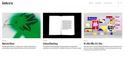
Intern Magazine Seminar 25.1.19 - Alec Dudson

6A2

Beginnings 
  • After completing degree started contributing to the blog KLLKT. Started having work published.
  • Started emailing magazines for internships, including 'domus', the architecture magazine. They offered an interview and a 2 month internship in Milan to help prepare for the design week.
  • Wrote a review of installation by Doug Aitken at the Hirshhorn museum, began taking an interesting in writing creative published pieces.
  • Then interned at 'boat' magazine unpaid. Meant he learnt a lot, was sure to put self out there and pitch ideas too. Each print issue they id they moved to a different city around the world, looking for genuine stories about people who lived there.
Making Intern
  • First addition was made using Newspaper Club and was formed through a lot of past connections and collaborations. Made a kickstarter campaign which got them a significant amount of funding. They took advantage of the current intern scandal in the US.
Printing Issues
  • It's hard to keep a print magazine running and see a return.
  • If making one in the future, make sure print isn't at the center of the business. There is a general move towards digital at the moment. 
  • Developed and diversified the website.
Current Intern and General
  • Made an Ace and Tate commission, created 5 stories for them, a launch event and a print publication for them.
  • Also launching a podcast, trying to get art council funding.
  • Began teaching and doing talks, worked way up into charging for talks/teaching.
  • Constantly trying to organise new clients to work with.
  • Doesn't necessarily need an office space. One illustrator who works from home gets up, leaves the house and then returns to do a days work.
  • Has one Intern - currently working at Open Set in Amsterdam (look into)

How to Get a Placement - Session 18.1.19

6B2/6D2

Ways of getting in touch:
  • Email
  • Phone - more personal and likely to offer better results as requires more energy/confidence. Best to write a list of topics beforehand.
  • In person - could be achieved by going to events and networking.
  • A letter or package - can be intriguing and a direct example of your creative talent.
  • Invite them to your event or exhibition.
How to make a good first impression:

In order to create an email that designers and employers will take seriously, make sure it is short, sharp and compelling. With a high level of confidence and using phrases such as 'I am' and 'I will' it allows the employer to trust your capability. A clear ask, such as 'I would like to...' can mean it is easier for them to give a response - rather than having to work through a complicated email. Give them a specific time and date too which they can either agree to or rearrange. If there is no response after week follow it up with a second email, use phrases like 'I am eagerly awaiting your response'.

Personality Test

One of the tasks of this session was to take 'The 16 personality types' test, to gauge our strengths and weaknesses and what might be a suitable career for us. My result was 'The Advocate - INFJ - A/T' which was characterised as quiet, mystical and idealistic. Some jobs that could potentially suite this personality type could include:
  • Blogger
  • Illustrator
  • Magazine editor 
  • Set designer 
  • Print maker 
These were all things I have considered for my future, although I have some concerns about their stability as future careers. This will perhaps require more research.

Potential careers with a graphic design degree:


Ones I would like to consider:
  • Junior designer in a studio
  • In house designer
  • Set design
  • Print maker - look up Dizzy Ink, Moo, Newspaper Club
  • Magazine editor
  • Exhibition design
  • Art Director
  • Illustrator
I found this to be a useful part of the session, I am now more aware of the opportunities for graphic design graduates. I would like to do more research on being an 'in house' designer, as I feel this could offer the stability I would like in my future career.  

Pricing Your Work - 14/12/18

6B2

Useful Sites/links:
  • Yourrate.co
  • Abstract on Netflix
  • Fatr channel Youtube - Chris
  • Invoice generator.com 
  • Quickbooks/Wave Apps 
  • Gov.co.uk - UTR (Unique Tax Ref. No.) - register for self assessment 
Invoice Example:


If not coming up with the money - pretend to be your own accountant, write in bold red, threaten have an accountant email address.

Elevator Pitch, Networking and Submissions

6B2

It's import to be able to sell work in a short, concise and engaging way so we did an exercise to refine our ability to talk about our work. These short sales pitches are statements that could be used for my website.

LOOK AGAIN: On the Moors - A children's storybook

What - A beautiful and rich storybook designed to celebrate Yorkshire's Ilkley Moor and to inspire children's imagination.

How - The book used textures that derived from the Moor itself, creating an authentic and immersive experience for children and adults alike.

The statements should be short and snappy but use engaging phrases and emphasis.

Networking

Hacks:
  • Hunter.io - can help you find specific emails of designers you'd like to network with.
  • Can use 'verbation' filter on google to find a confirmed email address.
  • Can put all potentials in BCC.
Email tips:
  • Don't make the email rambly 
  • Elevator pitch
  • No uncertain phrases like 'is it okay'
  • Give them a direct action to do
  • A CLEAR ask
  • Offer to buy them a coffee to chat for an hour.
  • Don't be shy about phoning people up.
  • Add an animation or picture on the email
  • Build a relationship with the client 
  • Always message on Instagram early morning their time.
Submissions
  • Play to what they want
  • Show your commitment and reach out for advice, this may make you stand out.